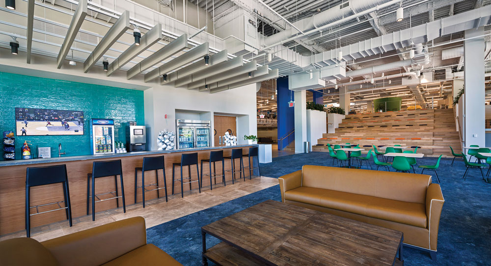
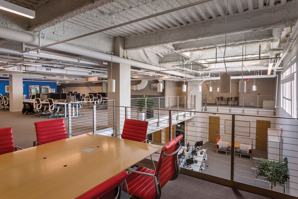
CHANGING STYLES, CHANGING SPACES: Danone’s White Plains, NY HQ

The modern workplace has evolved considerably in just the last 10 years. The shift from segmented perimeter offices and center cubicles to open-plan, collaborative spaces happened quickly—and is still happening. That physical change, of course, reflects the more philosophical shift in work styles that has come with a more globally connected workforce and changing generational preferences.
Danone, the parent company of such brands as Dannon yogurt and Evian water, embraced this collaborative way of working years ago but their physical workplaces were still catching up. When the opportunity arose to move their US headquarters, the company seized the chance to stay in White Plains, New York but create a new space that better fits their employees’ needs.
The solution? Renovating the fourth floor of a downtown White Plains shopping center into a new headquarters that unites Danone’s over 400 regional employees in one large, collaborative floorplan.
“Being within walking distance to restaurants, shopping and mass transit are important for our company,’’ said Dessislava Miteva, Danone’s senior vice president of human resources. “Similarly, an efficient and flexible design better matches the changing style of our workplace.”
RAISED EXPECTATIONS
Transforming a former retail space into an 85,000sf workplace meant basically going back to the drawing board. But because the lower three floors were still occupied by retail businesses—grocery, sporting goods and furniture stores—the construction team couldn’t simply gut the place and start over.
“It was built to be a store, not an office space, so there was a lot of new construction involved,” says James Dunn, project manager for Pavarini Construction. “But because the building is occupied nearly all the time, that took a lot of planning. The logistics were the hardest part.”
With shopping center hours and 24-hour cooling units for the grocery store, there were few to no windows for shutting down building services or working up from the lower floors. The Pavarini team had to map out every element—and communicate it clearly to the building managers and tenants—to ensure the work didn’t impact their businesses.
One solution that made a huge difference was the decision to build a raised floor. “We compared the risks and benefits of getting approval from the tenant below to work through their ceiling, within their limiting time constraints, versus building a raised floor for all the floor work,” says Dunn. “A raised floor turned out to be more cost efficient and easier to build and allowed us to work below the floor on our own schedule.”
The raised floor also came in handy for building the office’s 15,000sf addition over an existing parking garage. Parking garages are designed with a series of pitches to avoid rain water from pooling. While that’s a good thing for parking, it’s a problem for construction. With a surface that varied by as much as 1.5 feet, the team coordinated elevations well ahead of construction to match the new addition floor with the raised floor of the interior. As such, the plane from the addition to the raised floor is practically seamless and accommodates the finishes the client desired, from resilient wood to large-format ceramic tiles.
 ON THE GRID
Building the addition on the parking lot also posed an even trickier challenge: weight. The structural load of a parking garage floor isn’t as high as that of an office floor. In other words, to build an office on the garage, the team had to significantly reinforce the structure and get creative to avoid compromising the integrity of the structure as a whole.
First, they designed the structural steel package in smaller pieces so that lighter components could be lifted up separately and then bolted and welded the sections once in place. Next, the team used the parking garage’s as-built structural drawings to assess where the strongest structural supports were located. Then they painted grid lines over the surface to show the critical paths along which the cranes could travel. With those space limitations, the steel contractor used a spider crane, whose versatility allowed them to “unfold” the crane on the grid lines, pick up the steel, swing it into place and then fold the crane back up and move it back along the grid line tracks to the next location.
“Usually you can just move your crane over to the next spot, but we couldn’t do that in this case,” says Dunn. “We essentially built a structurally reinforced ‘roadway’ for the crane and steel to move around in this delicate structural environment.”
FINISH LINE
Finally, with the substantial core and shell work completed, the team focused on the interior fit-out. But another challenge remained: leaving the time and access to integrate Danone’s internal IT systems as late in the game as possible. “They were reusing a lot of their systems from their existing office, like wayfinding and room scheduling,” says Dunn. “Because they were still using those systems in their office, we had to organize everything so those systems could be installed as close to the move as possible.”
With their beautiful new, collaborative, central workplace, Danone’s employees now have the flexibility and the downtown amenities they were hoping for. And the Pavarini team has a project that tells the story of nearly their entire expertise.
“This project had core and shell, tenant fit-out, selective demo, building new elevators, building new risers, cutting out curtainwall—it really had everything,’’ says Dunn. “We’re extremely proud of the experience and how it turned out.”
Project Details
Size: 85,000sf
Client: Danone
Architect: CPG Architects
Services: Construction Management
Sector: Commercial
Completion: June 2018
Photos courtesy of John Baer/Building Images Photography.
