TRANSFORMING THE LANDSCAPE of Dementia
For nearly 40 years, the Alzheimer’s Society has been working to provide care, support and research for people with dementia and those who care for them. In 2016, the organization launched a bold new strategy that not only set out their goals for the next five years, but also retooled their brand to help everyone more clearly understand their mission to transform the landscape of dementia forever.
As luck would have it, this rebranding coincided with the expiration of their office lease, which housed them in two separate, old-fashioned, traditional office spaces. The timing was perfect to find a new space that better represented their organisation and brought them together under one roof.
“One of their new values is ‘we are united,’” says Gary Ball, Structure Tone project manager. “Bringing everyone together was an important representation of that.”
In addition to offering a more contemporary workplace for its staff, the Society wanted its headquarters to showcase the very strategies they promote for creating dementia-friendly communities. When it comes to a physical space, visual cues are key.
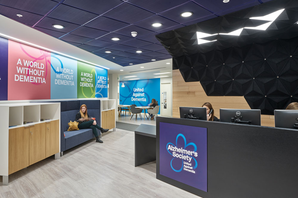
“When I first saw the design, I thought, ‘Wow, that’s a lot going on,’” says Ball. “It was very busy, with lots of colors, graphics on the wall and signage. But when you see how it all works, it really makes sense.”

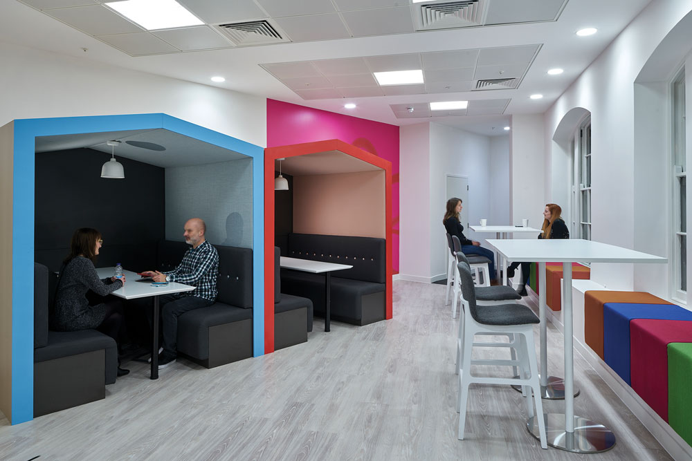
The open-plan workplace includes spaces for quiet conversations.
The Structure Tone team worked closely with architect HLW and the Society to employ those dementia-friendly features, including:
Colour.
Bright, space-defining colours can help people with dementia remember and navigate through a space. The Society’s offices use 24 different colours on one floor alone, helping identify different areas of the office.
Signage.
Signage is not only frequent throughout the office, it’s also bold. Signs are large and often installed on a backing that gives them a more tactile, three-dimensional pop from the wall.
Artwork.
Much like the colour technique, artwork and special graphics on the walls help mark different areas of the space and serve as wayfinding tools.
Another factor in the new space was its acoustics. As a largely open-plan office with hard floor finishes, noise could have posed some problems. The project team installed some fabric-covered cone-shaped structures along portions of the walls, combining the acoustic solution they needed with the visual and tactile cues that support their wayfinding strategies.
“You don’t realize what an impact the surroundings of a building can have on people with dementia,” Ball says.
“It was truly interesting to learn more about the needs of people with dementia and how much design can help.”
Project Details
Size: 22,600sf
Client: Alzheimer’s Society
Architect: HLW International
Engineer: Elementa
Owner’s Rep: Cluttons LLP
Services: Construction Management
Sector: Nonprofit
Completion: September 2016

