United States
EATALY London
How Structure Tone brought the taste of Italy to London
When Nicola Farinetti and his team chose London for Eataly’s latest location it was natural for them to turn to longstanding collaborators Structure Tone to deliver their new premises: Structure Tone’s Global Platform has been intentionally designed to service international corporate customers such as Eataly, and after successfully delivering projects in New York, Toronto and Dallas a vast reservoir of knowledge and relationships had been amassed.
Inspired by Italy’s deep love of Slow Food – and wine – Eataly’s brand new premises at 135 Bishopsgate offers three restaurants and bars on two floors, six separate eateries, a cookery school and a market that stocks over 5,000 products. Flavour and conviviality are the two golden threads which run through each of the various spaces, however, pulling off such a feat – where the interiors have been stripped right back to spotlight the grills and hams and breads and wines and canolis and mozzarella – takes a consistently restrained approach to design, engineering and construction.
Let’s take the tour –
Main Entrance and Gran Bar
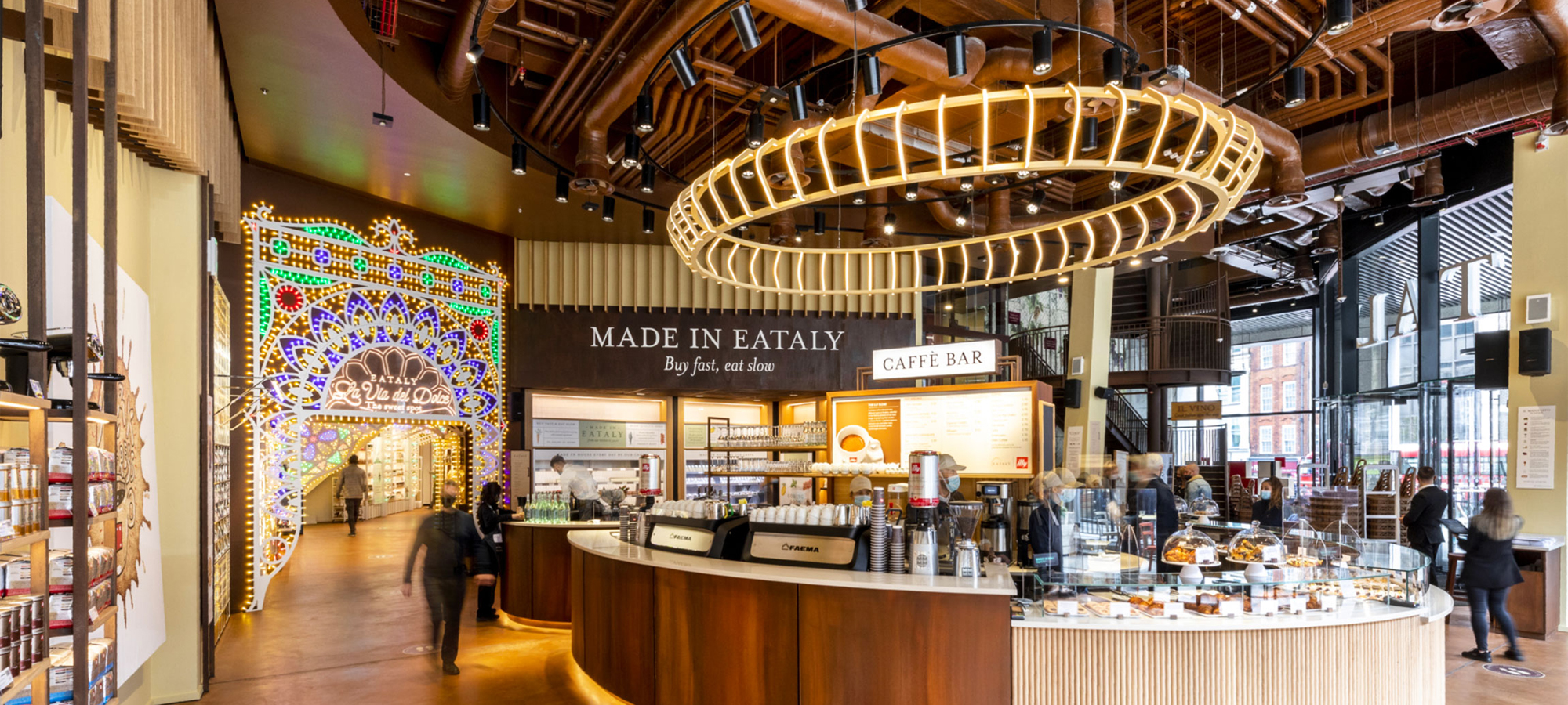
As you walk through the main doors you cross a threshold into a magical portal known as the Gran Bar. Choice is the order of the day, with open displays of delectables to grab and go and a seating area for those wishing to people watch. An elliptical marble-topped servery stands in the centre of the double-height space with an identically shaped pendant light floating above. Instead of having your eye drawn to the aesthetics of set-piece architecture, the servery has been templated to work in conjunction with the feature light to create desire lines, which draw the visitor intuitively towards the fresh coffee, chocolate and ice creams.
One of three mezzanine seating areas dotted around the demise stands on an exposed, patinated corten steel deck which works with the amber floor to further draw focus to the servery. The vertical timber slats to the curved front of the counter complement the timber slats which form a feature on the simple rendered wall behind. The contrast of the natural finishes coming together under such tension is satisfying to the eye without being overpowering.
One of the most striking things throughout Eataly is what you don’t see – the servery is one of a number of standalone set pieces that have been resolved with completely clean lines – with all services concealed. This is all the more remarkable given the myriad pieces of equipment which require power or drainage to exactly the right gridline. The ceiling of the Gran Bar hints at how this has been achieved, with all the high-level services neatly arranged in zones above the transom. The unencumbered floor, however, gives no clue to its makeup or the volume of basebuild obstructions which lie underneath the surface.
La Via Del Dolce
The floor guides you round to a destination within the destination – the intriguingly titled ‘La Via Del Dolce’ – where a million lightbulbs pop and an exotically tiled floor denotes the crossing of another threshold into an unexpected, but delightful, portal filled with fresh canolis, chocolate and gelato. The Pastry Lab perpetuates this sense of otherworldliness – think Willie Wonka’s Chocolate Factory, but the Italian version designed by Dolce & Gabbana – where patissier slash scientists work purposefully in the search for confectionary nirvana.
Fitting such an aspirational design intent – whilst also delivering a highly commercial retail space – into the frame of a commercial office block built at a time when shoulder-padded people drove DeLoreans required a considered approach. The resultant construction strategy retains Eataly’s sense of mystique with all services pulled as tight as possible to the underside of the slab. Whilst the visitor’s gaze is drawn to the feature lighting by Paulichelli, and the treasure trove of delights that sit behind, they accept the ramped floor and lowered ceilings created by the heroic downs and carrying the 12 stories and 360,000ft2 above. By specifying plant and machinery with relatively high power to mass ratios and cable for its malleability the services have been kept sufficiently above the public’s eyeline. Careful coordination of the decorative timber ceilings further obscures less than magical items such as ceiling-mounted recirculation units and their composite ductwork runs, despite the floor to ceiling height dropping to a constrained 2200mm in places. As these vital pieces of plant whirr silently above their heads, drawing stale air through ducts to risers for expulsion at roof level 50m above, all the appassionati feel is a sense of wonder.
Builders and designers collaborated to enable Building Control to confidently sign off the omission of the handrail to the ramp, ensuring the destination corridor maintained a wide, unencumbered retail space. The wonder has to be paid for with commercial pragmatism.
Breathing Space
The volumes open up once leaving the sensory wonderland of La Via del Dolce to reveal a series of very simply clad, white porcelain tiled columns and exposed timber ceilings.
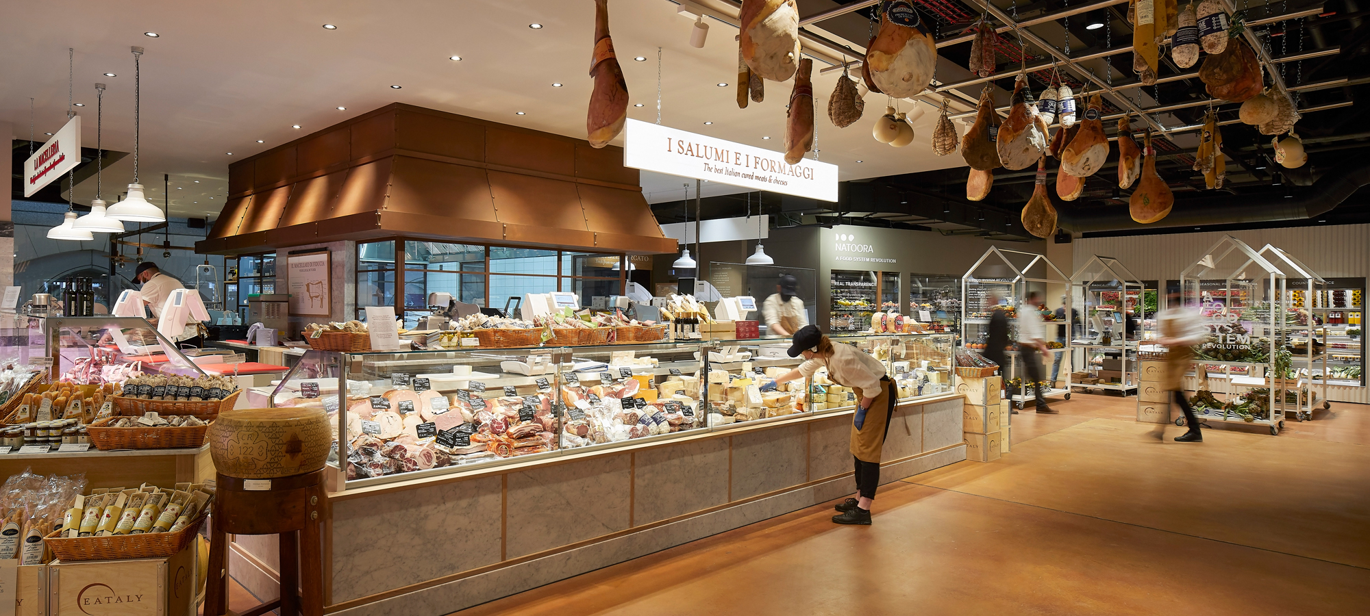
The relaxed and rustic feel is matched by a more traditional catering offer, first being the Fresh Pasta station which leads to a Bakery before sweeping round to the Gastronomy Bar. The original mood boards showing wicker baskets, grained oak, quarried marble, crittal glazing and grey etched floors have been faithfully adhered to.
Whilst the pasta and freshly baked bread take centre stage, it becomes clear, from a construction perspective, that the refined materials palette and more regular shaped space enabled key trades such as dry lining, joinery and MEP to systemise their installation processes. Generic setting out rules have been observed i.e. all sockets have been set at 1200 above ffl, beam and column casings have been lined and leveled, as have the countertops.
The benefits of Nik Quarm’s Think-Do-Think approach led to the flooring becoming systemised throughout the 42,000ft2 demise, despite wicked problems such as the basebuild floor to ceiling heights preventing drainage falls being achieved compounded by a non-negotiable ban on coring through the bunding which protects Liverpool Street Station below. The time taken to follow his instincts and refine the resultant solution – pipework, including a vacuum drainage system, fixed to unistrut in the void with standard RAF on top, followed by 20mm gypsum board substrate with a power floated 4mm Architop cement finish – protected the programme at the back end and the innovative finish has ensured unprecedented levels of consistency compared to the typical hand-trowelled application.
The architectural and construction restraint required to ensure bread is the star is difficult to overstate. The decision was taken to model all the architectural elements in the Revit model as well as the services. This encouraged ever more creative ideas as the team really bought into protecting Eataly’s design intent despite the complex issues associated with fit and the complexity of interfacing with Eataly’s own global supply chain. A full-time technical designer ran the dynamic BIM process for 10 weeks, adapting the model as information was dripfed from each of the 62 client direct orders. The bakery is an excellent example of a Main Contractor integrating with skilled Sub-Contractors (Electrolux, Holten, and SHW Catering Consultants in this case) to develop tech subs, approve, procure, install and commission at pace.
The bakery is also a good example of how Eataly constantly converts functions into experiences for customers to engage with. In this specific case, the wood-fired oven has been dressed, boarded out and finished with eyecatching brick slips made to look like stone quarried from Assissi. The twin walled flues, in highly polished stainless steel, are also aesthetically interesting. They also fulfill an important function as one of five Soot Abatement systems throughout Eataly which clean the air from various pizza ovens and charcoal grilles prior to expelling it into the London sky.
Gastronomy Bar & Alla Pala Pizzera
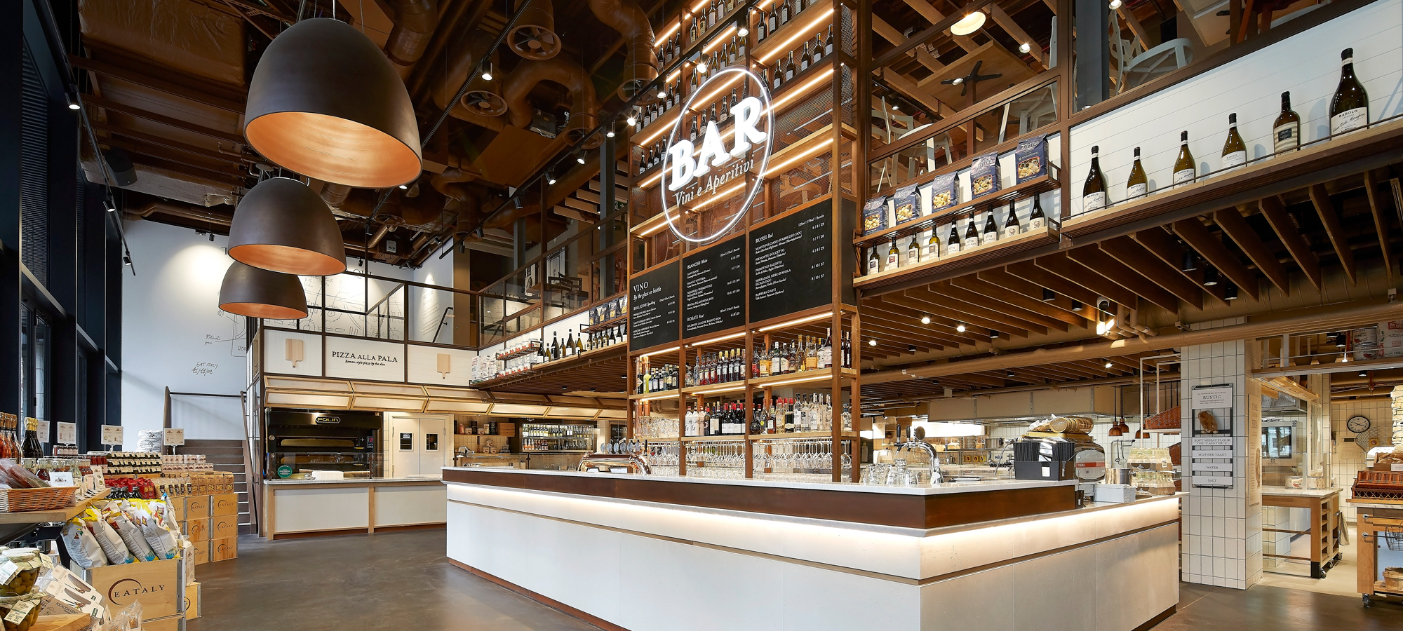
The uncluttered floors and ceilings, concealing vast amounts of tech, invite people to eat with their eyes from a central corten steel island. The simplicity of the lighting canopy and track ensure focus is on the food and drink at all times. The modernist metalwork continues in the framing and balustrade which elegantly connects to the Torino Bar upstairs via a bespoke circular feature light.
Huge pendant lights run parallel to the façade in double-height space to create an excellent spot for people to meet and delight in the slow food experience.
The Alla Pala offers pizza by the slice and the corten steel staircase wraps around this counter and ascends to the Torino, overlooking the Gastronomy Bar and the bustle of Bishopsgate outside.
Lobby area to base of escalator / stairs – Wow Area
Eataly’s rustic theme continues in the lobby where a hand-finished concrete render provides a flourish to an area, which includes takeaway fridges and checkouts for customers as they funnel through the exit.
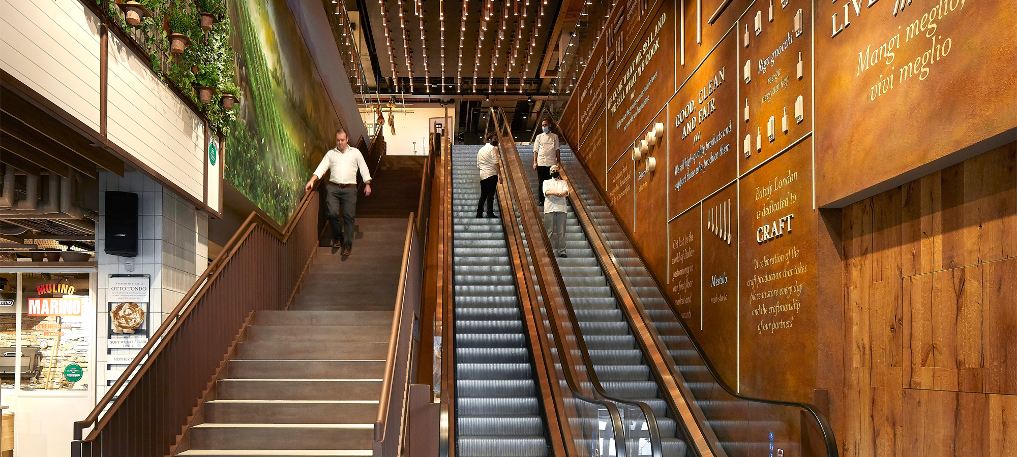
The double-height space, however, entices the visitor up the escalator where they are treated to a mural in oils depicting the rich, living history of the Eataly brand before being immersed in a stunning lighting installation at the top. The feature lighting by Creative Cables, which required the installation a temporary crash deck above the staircase and escalator opening, enabled the team to form a plasterboard bulkhead and install 236 pendant lights at varying suspension heights tapering on both sides to achieve a sense of envelopment for a visitor journeying to the first floor.
This latest destination hints at another of Eataly’s deliberate strategies – to create a series of hidden gems amongst the dense grain of their demise to delight the visitor upon discovery. Like an Italian John Soanes Museum, flavours, tastes and sensations unpack from the most unlikely and unexpected nook or cranny and the effect is one of sheer joy.
First Floor: Cucina del Mercato
The Natoora Vegetable Market stands at the top of the escalator. This is the first London concession of a revered brand which will undoubtedly become a welcome discovery to those outside the loop. As previously, function becomes experience as customers can walk into the refrigerated area and participate in preparation with their resident artisans.
From Natoora the visitor enters Cucina del Mercato where the clean modernist metalwork and templated timber curved countertop to match the curved lighting track above are very pleasing to the eye.
Once again, the clean lines created by impediment-free floors and ceilings allow the space to draw people in. In a city starved of hugs and lunch this will undoubtedly be a very popular space in post-pandemic London.
Looking through the lens of construction, the terrazzo tiling to the walls is notable. It required a change from the original design to be more fittingly resolved with much larger, heavier tiles. By changing the substrate, shortening the stubs and procuring a more flexible adhesive it was commissioned with no discernible joints. Additionally, acoustic sonos spray has been applied directly to the rib-deck, coordinated alongside the plasterboard ceilings and high level services which include more feature pendant lights from Creative Cables.
Adjacent to the Mecato Bar and Restaurant is the dry aging display fridge. In what’s evidently the true Eataly style, an architectural feature out has been made out of the dry aging process. Here you can learn how the aging process works, pick your cut of meat as it hangs for cooking or order for home delivery.
Pasta e pizza / Caseificio
Working back round the first floor leads to a 150 cover Pizza restaurant. Continuing the theme, each serving station and prep kitchen is highly legible with no services distracting from the ‘pick – serve – go’ rhythm the brief demanded. The uniform heights of the marble worktops the diversity of choice at perfect eye-level has been pulled off with aplomb, and the white-tiled columns, timber slatted ceilings (masking the sound attenuation and hi-tech services that sit behind) and rusticated walls and floors bring the Trattoria to Bishopsgate.
At this point it’s evident that Eataly have delivered a great environment for chefs to work, with everything useful locatable within 1400mm radius.
Casefigio
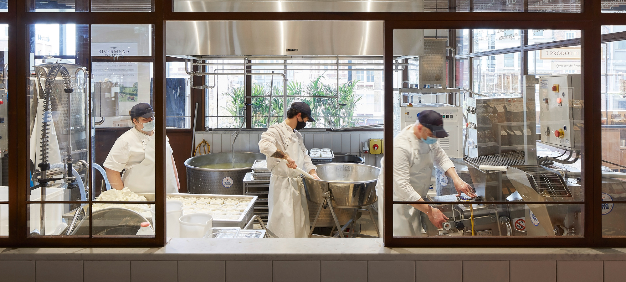
Like a meteorite that landed in the City, Eataly’s mozzarella-making machine stands proud in the pizza area and its promise of food prep as symposia is likely to become a sensation. This one set-piece, above all others, provides a great metaphor for their brand and also the construction process itself, thoughtfully combining hi-tech innovation with simplicity to deliver theatre to the consumer.
Grocery gondolas and fridges are neatly lined, powered and air conditioned without appearing so, allowing people to discover a range of produce and brands that London hasn’t seen in one place before.
Enoteca
Nicola’s sketch on the back of napkin of modern ‘caves’ provides the inspiration for a new ‘shop – learn – sit’ experience for London’s diners. Once again, Eataly have provided a vast array of choice in an otherworldly environment. The timber slatted ceiling with services neatly packed away and clean floors allow the wines to shine. The textured stucco rendered walls and lush ‘Green wall’ at the entrance transport the visitor to a rustic vineyard off the beaten track in Tuscany or Umbria. Yet again, imagine the feeling for the epicurean to stumble across such a place for the first time, completely by chance! Pure elation!
Moving from meats through groceries through wines it’s obvious that Eataly have really paid attention how their Italian producers could be complemented by local UK suppliers to meet a series of unmet needs for Londoners. The opportunity to grab a bottle of wine from Enoteca, enjoy it with a meal at one of their restaurants, or pick up some pomodoros on the way out, some fresh mozzarella made in store, and a bottle of olive oil for tomorrow’s lunch, and top it all off with a cannoli as you walk to Liverpool Street is to be savoured.
Next stop is different again: The Rotunda – an iconic part of Bishopsgate, once symbolising the bustling empire of Fred Goodwin’s RBS – now plays home to Eataly’s cookery school, where the appasionati learn about the food they love, and thankfully the only thing getting shredded will be basil leaves.
The tour doesn’t finish at the Rotunda – there’s plenty more for the epicurean to explore.
Bar Terra
With its marble chamfered worktop, brass pendant lighting and brass drops that match the design of the furniture, Bar Terra provides another whimsy for the visitor to stumble across. The bar has been templated out with every unit in the counter accounted for, enabling the power and drainage to protrude in exactly the right spot. This, in turn, enables easy, fast connection. The effect is timelessness created by the natural material palette, modernist designs and transcendental craftsmanship but the workflow has been more akin to an F1 Pit Crew.
Terra Restaurant
The focal point of this Trattoria is the opulent grilles – the identical casts of which reside in the compound of the manufacturer’s hero – one Senor Lionel Messi! Intimate seating is arranged around the restaurant, facing these copper fire gods, offering diners more theatre whilst they unwind. Everything is tied together via the use of biophillia, enhancing the natural materials used throughout the demise with the marble counters, blond timbers, acid etched floors, simple lighting and plain tiling.
Teamwork
The increasing expectations we’re seeing in major cities such as London, New York, Toronto and San Francisco requires an F1 Pit Crew style approach to construction workflows. Upgrading the status, role and training of Construction Managers is essential in this transition, as Information Release milestones can only be consistently met through their constant quarterbacking with the rest of the team, up and downstream. Without this, complex, fast-moving projects with multiple unknowns cannot be de-risked early enough to protect the key elements of the brief. Imagine what the outcome of Eataly would have been like if key pieces of equipment and statement design installations became unaffordable as a result of design fit complications?
As a corollary, the Construction Manager’s deep understanding of specific sub-contractor capabilities and people, is vital for retaining control over CDP and budgetary management. Similarly, unbundling packages, clustering sub-contractors to anticipate and work through challenges, and, tracking assets (including long lead items) from factories to workface in the correct installation sequence requires one controlling mind.
The Construction Manager’s interplay with the team ensured the services would fit into the ceilings and floors without distracting from the magic of the spaces. However, constrained by floor to ceiling heights and beam positions, our on-site designers coordinated with the design team and specialists to ensure mechanical pipework was installed as tight as possible to the soffit, followed by the electrical cable tray which was installed to avoid clashes with hangers supporting the ceilings (and hams), pipework and grilles all whilst maintaining a strict aesthetic.
Thorough, early validation of the basebuild systems determined which elements needed attention. Whilst fibre installation issues and fire alarm upgrades and external fabric repairs could be accommodated, the new cooling and heating loads were significantly higher than the basebuild limit. This challenge was mitigated by x, y and z but sometimes the impossible just isn’t possible. In the end, a prioritisation algorythym has been devised to direct power to the most essential functions in the event that demand exceeds supply at some point in the future.
The physical outcome consists of three restaurants and bars on two floors, six separate eateries, a cookery school and a marketplace, however, the real achievement is a thoroughly well resolved series of spaces where the architecture and construction provides a great background for people to live again.
COMPANY
sectors
Architect
Gensler
Client
Eataly
Location
135 Bishopsgate, London EC2M 3YD
SF
42,000
Contract
Design & Build
Architect
Studio Eataly, Gensler & Structure Tone
Project Manager
Blackburn & Co.
Primary Engineer
Structure Tone
Quantity Surveyor
Alinea Consulting
